
Communicating with Color
Jul 17, 2023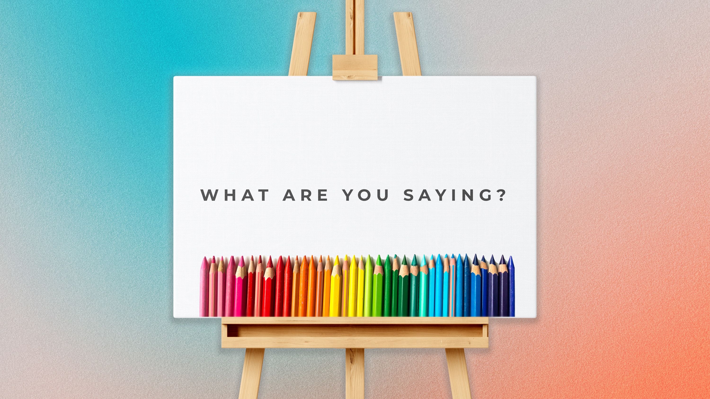
COLORS COMMUNICATE
The morning session speaker walked into the conference room. She had a commanding presence. Though on the shorter side, she exuded a sense of authority.
In her high heels, she stepped onto stage. I spotted her hands shake a little as she began to speak. She was nervous, but I noticed.
She was communicating a more predominant nonverbal message.
This speaker was wearing a striking black shirt and bright red pants. She was communicating power.
I leaned in.
There was a diverse group of speakers at this conference. But this particular speaker stood out.
Her commanding presence told me that she knew what she was talking about. Of course, her talk was full of excellent informational content; she wasn’t BS-ing her way through. But the thing that gave me assurance that she was a reliable source and I could trust her knowledge and authority on her topic were the nonverbals she intentionally communicated through the colors she wore.
What do you communicate with the colors you choose?
Whether you are presenting in front of a room of people or over a video conference, are you being intentional about how you present yourself? How do you use your personal branding by creating new business cards, updating your website, or generating graphics for your social media page? What colors are you using and why?
“Colors are light waves of different lengths, and they affect us even when we have our eyes closed,” writes Barbara Koltuska-Haskin, PH.D. She says that colors can increase our visual memory and physiological arousal.
Colors are powerful. They affect our brain function. For example, red increases our memory of negative words while green increases our memory of positive words.
Studies performed by the renowned Pantone Color Institute® show that when a word or phrase is in color, consumers are up to 78% more likely to remember it compared to if it was in black and white.
If color affects our memories and we want people to remember us, our product, or message, then we should leverage our use of color. Memory is not the only thing colors affect.
In his article “Color of Psychological Functioning,” Dr. Andrew Elliot points out that colors affect our mood and energy levels. They provoke emotion.
Colors have an impact on our brains and how they respond. Let’s take a look at how different colors affect the human brain in different ways.
COLOR PSYCHOLOGY
Warm Colors:
Warm colors, like yellow, orange and red, are very stimulating. They energize and motivate us. They can be exciting and arouse a sense of passion. However, if warm colors are too intense, they can be overwhelming and irritating.
“Red is one of the most influential colors when it comes to an individual’s mood,” MasterClass article reads. “The color red has associations with strong emotions, such as love and anger, and can have a significant effect on a person’s disposition.” This is why we see emergency signs use the color red. It elevates our level of alertness so we can respond to crises.
Yellow is bright and joyful. It reminds us of the warm sun. Yellow triggers happiness in the human brain. However, too much yellow has been known to cause feelings of frustration, eye strain, and make babies cry.
Orange is the combination of passionate red and cheerful yellow. The human brain sees it as fun, enthusiastic, and encouraging. This color is known for triggering creativity.
Speak with People chose orange as our main color because we believe in the importance of using words to encourage and breathe life into others. We want to put an end to boring presentations and use creativity, stories and laughter to build a connection with the audience that causes them to lean in.
Cool Colors:
Cool colors, like green, blue, and purple, have a soothing effect on our minds and bodies. These colors calm our nervous system and reduce anxiety. On the flip side, too much use of cool colors may trigger feelings of sadness.
Blue, like a still body of water, has a calming effect on our brains. Many companies use the color blue to communicate authenticity and trustworthiness. Blue is seen as a compassionate and safe color. Worldwide surveys show that even across cultures, shades of blue are most popular when it comes to personal preference.
Green is prevalent in nature. Trees, bushes, and grasses make our minds think of growth when we see the color green. This color combines the calm of blue and the cheerfulness of yellow. It represents connection and learning.
Purple is a blend of powerful red and calm blue. Throughout history, purple has represented wisdom, royalty, wealth and ambition. Today, it is also perceived as a color that sparks inspiration, creativity, imagination.
Speak with People has two secondary colors: one a shade of blue and the other of green. We chose blue because we value authenticity, professionalism, and trustworthiness. We use this color on our corporate training webpage.
We also believe that becoming a healthy and effective communicator and leader requires learning and improving. This is why we use a lot of green on our coaching webpages because green increases productivity and growth.
Neutral Colors:
Brown is perceived as honesty, dependability, and reliability. When UPS branded itself as “What can brown do for you?”, they were leveraging what our brains automatically associate with the color brown. When delivering packages, they wanted people to choose them because of their reliability.
White is known for purity, like a bride on her wedding day. This color represents good, clean, and light. White is crisp, clean, and can be associated with high standards, orderliness and perfection. When it comes to websites, many businesses choose white to show professionalism and gain the trust of their buyer.
Black, on the flip side, comes with a sense of mystery. Black can also provoke feelings of grief, like at a funeral, or, in some cases, evil. Depending on the context, our brain will process this color as powerful and authoritative, or elegant and formal.
Gray has a dreary, depressing effect on the human brain. White and black are both powerful colors, but when merged together into gray, it becomes dull and lifeless. When used properly, especially with splashes of color, gray can be seen as sophisticated, contemporary, or high-tech.
LEVERAGING COLOR
Each color triggers different emotions and associations. This is true for what we wear, the color of our products, and our company branding.
According to a study conducted by the University of Loyola, Maryland, color increases brand recognition by up to 80%. The colors we choose are important.
When it comes to logos, for example, companies distinguish themselves from the competition by choosing colors that represent their mission and values.
Based on their mission statements, would you prefer the trustworthiness of a Ford (blue), the joy and excitement of a Ferrari (yellow), or the highest quality of Honda (red).
Trying to decide on a cell phone provider? T-Mobile values passion and innovation (purple). One of AT&T’s core values is to pursue excellence (blue). Verizon promises a strong network (red). Sprint wants their customers to enjoy life to the fullest (yellow).
How about TV? Do you want your kid to watch an exciting show on Nickelodeon (orange) or learn something new on Animal Planet (green)?
KISSmetrics reported that when buying a product, 85% of customers place color as a deciding factor.
Whether we realize it or not, we are making decisions all the time based on color.
Research from University of Winnipeg reveals “People make up their minds within 90 seconds of their initial interactions with either people or products. About 62‐90 percent of the assessment is based on colors alone.”
So how will you use color to communicate with your target audience?
Here are some questions to ask yourself when deciding what color to use when giving a presentation, creating online media, or developing a product:
What are your mission and values?
Take a look at your mission statement and values. This might be your company’s brand or your personal brand. What color(s) best align with these core principles?
If you don’t have a clear personal mission statement and core values, Speak with People offers the Life Design Program which walks you through developing your personal brand, personal mission statement, and core values. This program is very helpful in discovering the essence of your personal brand and how to communicate it.
Who is your target audience?
My husband loves the color orange. It’s exciting and energizing. He even owns bright orange sneakers. However, he is a senior level director of a Fortune 500 company where he is constantly working with engineers. He intentionally chooses to wear shades of blues to gain the trust of his team, customers, and suppliers.
If your audience wants to rest and recharge, cool colors like shades of green are the ticket. On the flip side, if your audience is a group of kids, bright and exciting warm colors may be better. Focus on the wants and needs of your audience.
What are you trying to communicate?
Just like how the conference speaker I mentioned at the beginning of this article communicated their authority by wearing red and black, what do you want to communicate?
Are you launching a new podcast on creativity? Perhaps you’ll choose purple or orange.
Are you meeting a prospective customer and want to demonstrate your professionalism and reliability? Blue might be a good choice.
Are you designing a new product that helps people relax? Cool colors like green would help communicate that message.
Identify what message you want to communicate. Name the emotion you want your audience to experience. Then select the color from above that best represents what you want to convey.
Amplify your message by maximizing your nonverbal communication. Leverage the power colors have on the human brain.
By Caitlyn Neel - CoFounder, Speak with People
Caitlyn uses her media experience and life coach certification to help clients develop their personal brand.
https://www.personadesign.ie/colour-psychology-cracking-the-colour-code-for-profitable-branding/
https://www.masterclass.com/articles/how-color-can-affect-your-mood